Overview
NocoDB is an open-source platform that transforms your database into a smart, spreadsheet-like interface. It enables developers to manage both data and schema visually—without writing any SQL.
Joining as the founding product designer I lead all design efforts at NocoDB, from the product re-design, web design, media assets and more.
Why a revamp?
While it was initially designed for developers, we realized that to grow and monetize sustainably, we needed to pivot toward business and enterprise users — users who expect clean interfaces, predictable UX, and little to no onboarding friction.
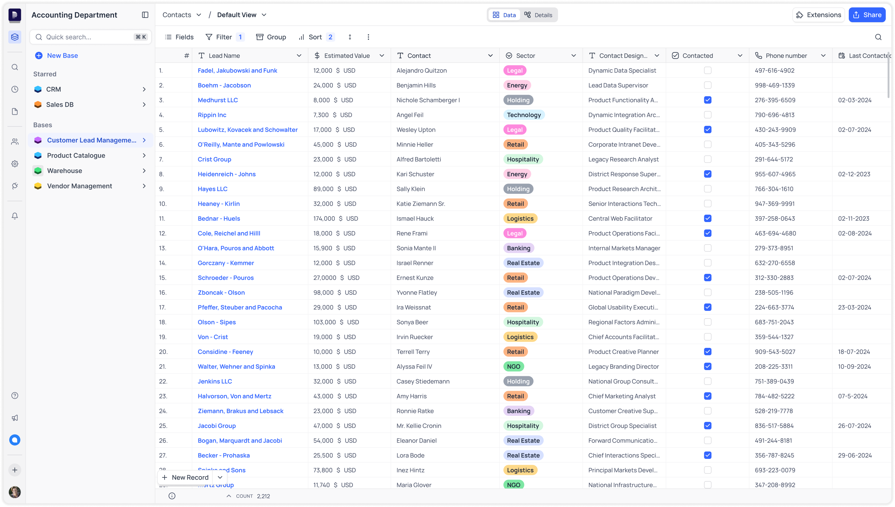
But the product experience wasn't inline with that. Below are some screenshots of the product before the redesign:
Let’s dive into the main screen (i.e. the table trid view) of the original UI, and explore some of the key issues that needed fixing.
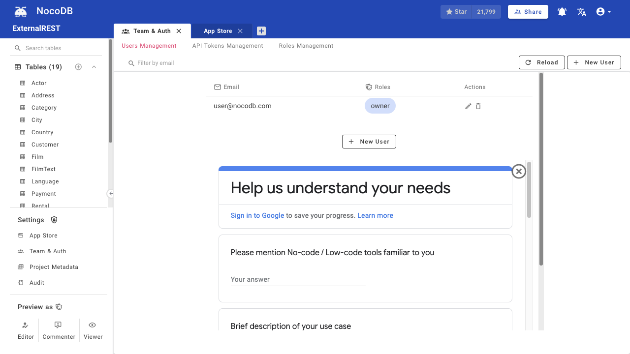
Poor Navigation UX
Navigation was split between the right and left sidebars & the top bar was had redundant elements.
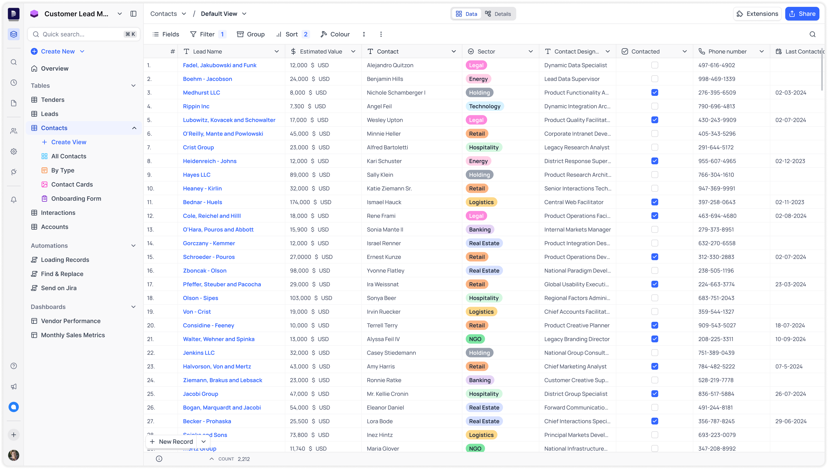
Inconsistent components
Design mismatches for the same components reduced confidence and increased cognitive load.
Unfamiliar Arcitecture
Page navigation was not intuitive to the user, requiring refrence to documentation.
Poor Hirearchy
Lack of visual structure makes it hard know the current view and to scan or prioritise information.
Neither Minimal nor Aesthetic
The interface feels cluttered and lacks visual harmony, making it harder to focus.
Research
To guide the redesign, we conducted research across three dimensions — our users, their real-world use cases, and analyzing our competitive landscape.
User Research
We identified that NocoDB was often set up by technical users, but ultimately used by non-technical users who primarily focused on data editing. This led us to uncover two core user personas.
Technical users
Who: Developers, IT admins, or internal tool owners.
Usage Pattern: High engagement during setup and configuration; low day-to-day usage.
Main Tasks:
1. Connecting data sources.
2. Setting up tables, views, and automations.
3. Managing permissions and integrations.
Business users
Who: Business users, support teams, project managers.
Usage Pattern: Low engagement during setup and configuration; high day-to-day usage.
Main Tasks:
1. Viewing and editing records.
2. Collaborating with team members.
3. Filtering views, commenting on records
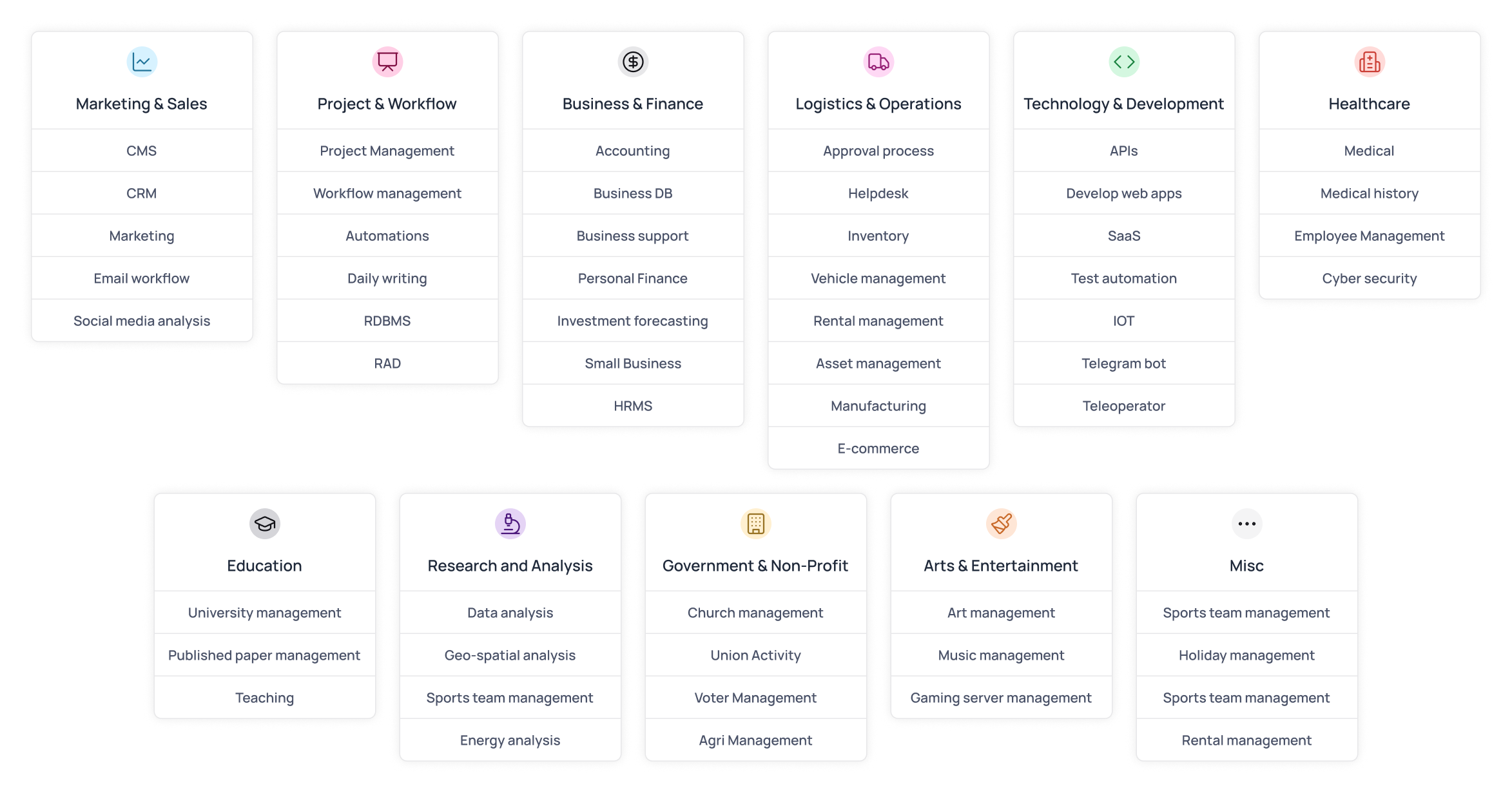
Usecases
We actively collected user data through a form early on to guide the redesign. Each sign-up was tied to a specific use case — such as internal tooling, CRM data management, or data syncing — helping us understand where the product needed to evolve.
As you can observe, our users were truly diverse in their use-case context, with individuals across industries using NocoDB in ways we hadn’t imagined.
Market Research
We also wanted to understand other tools operating in the same space (i.e. no-code database management platform) to identify common patterns, gaps in the market, and opportunities to differentiate NocoDB for enterprise use cases.
Baserow
Closest competitor
Monday.com
Workflow-Driven Platform
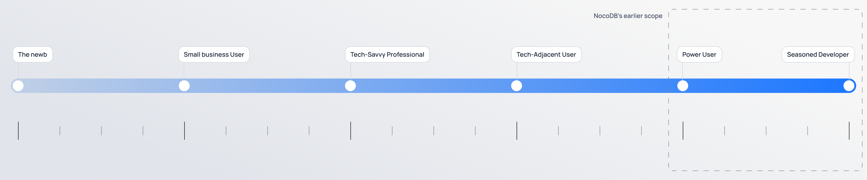
The Goal
The goal was to expand NocoDB’s user base by truly democratizing databases — making the product not just for power users and seasoned developers, but intuitive for users of all backgrounds and skill levels.
Guiding Principles
We recognised that moving forward, the only way to ensure success was by keeping the following principles in mind when redesigning any experience.
Inclusivity
Make the product accessible to all users, across roles, industries, and use cases.
Simplicity
Design clear, intuitive flows that reduce the need to rely on documentation.
Flexibility
Support advanced workflows for power users and ease for non-technical users.
Consistency
Reduce friction by maintaining visual and functional consistency throughout.
Design
To support the shift toward enterprise users, the redesign focused on improving core usability, scalability, and visual clarity across the product. We rethought foundational elements, from navigation to user role, while maintaining flexibility for technical users and approachability for business users.
Curious about how I approached the design of a specific feature? Feel free to get in touch—happy to walk through the details.
Smarter Navigation
Mini bar for Workspace pages
Now only shows workspace-level pages like Members, Integrations and Settings.
Consolidated navigation bar
All navigation through the sidebar, minibar for workspace entities & main sidebar for bases.
Smarter Grouping with labels
Starred bases grouped at workspace level; tables, scripts & dashboards at project level.
Support Pages
Quick access to chat, what's new, help, and the create new button.
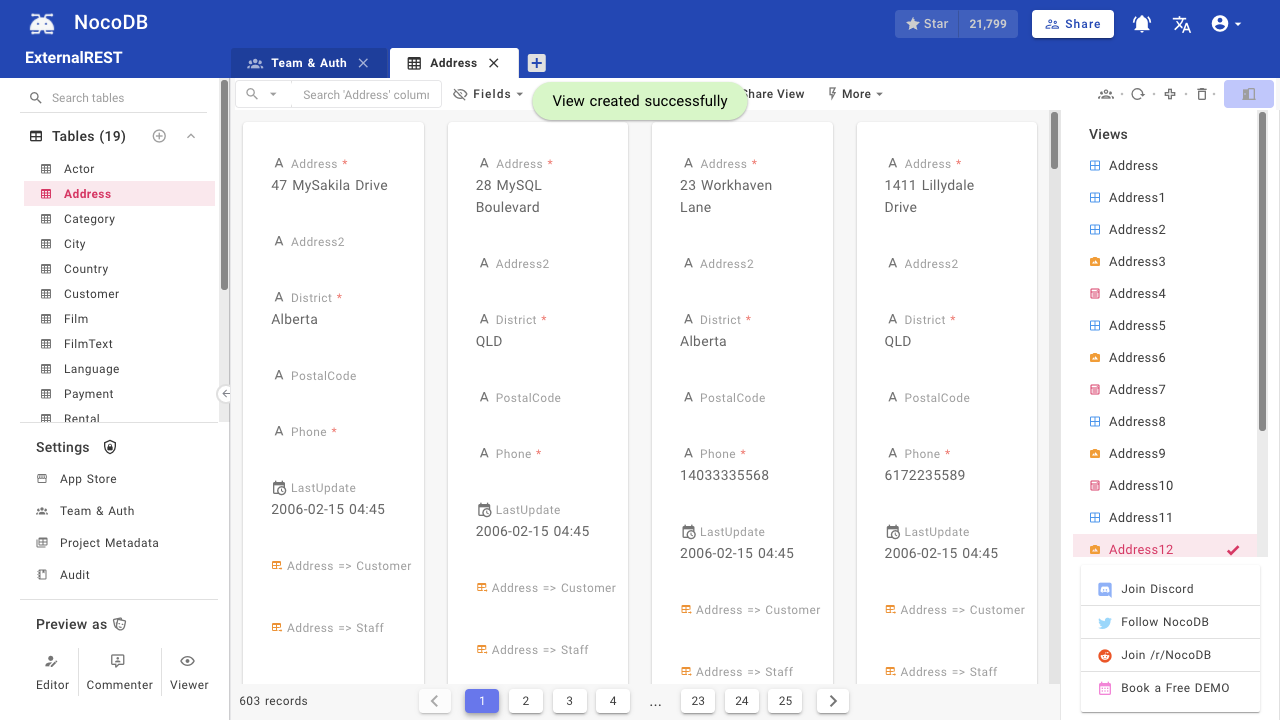
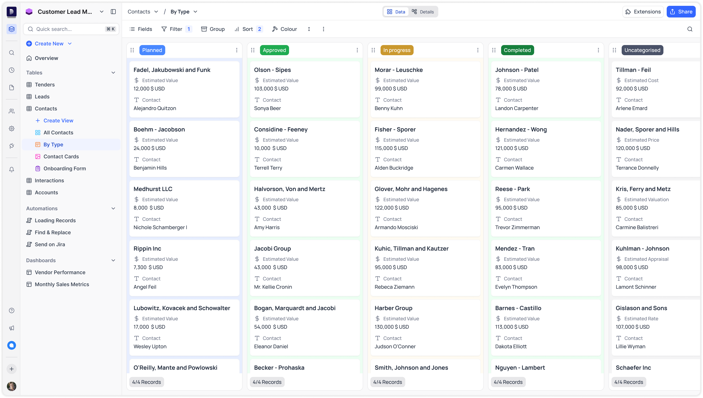
Richer Views Experience
We redesigned the existing Grid, Gallery, and Form views for better usability and visual consistency, and also introduced two new views — Kanban and Calendar — to support more diverse workflows.
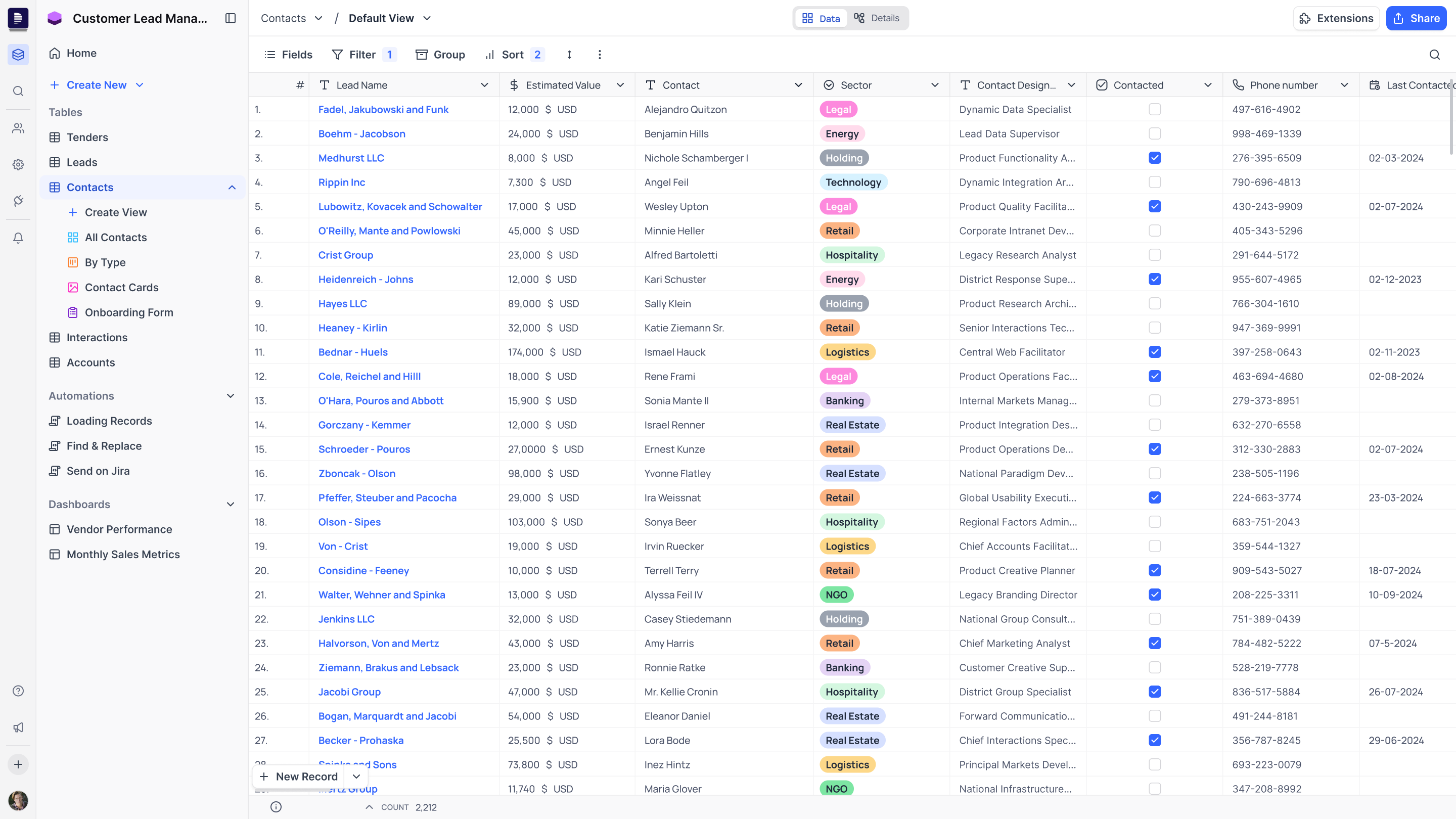
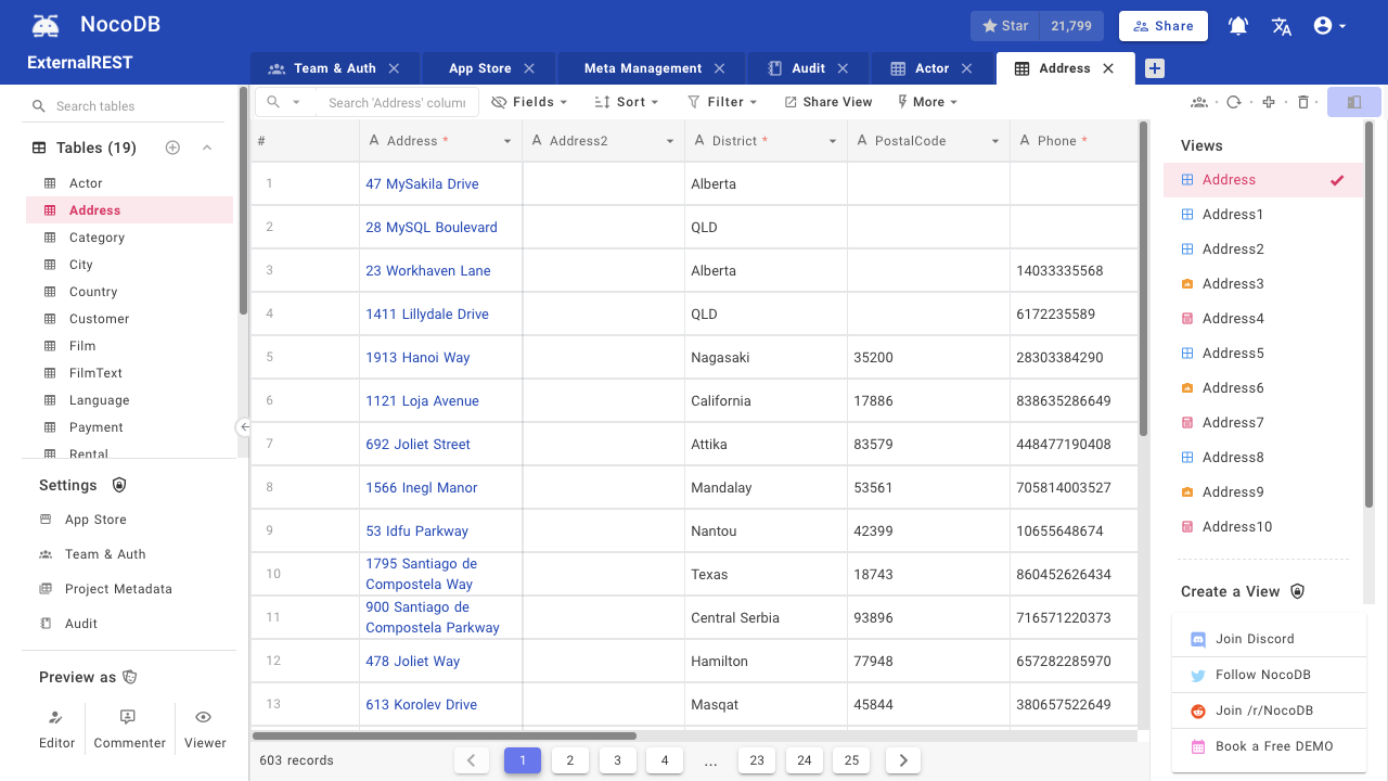
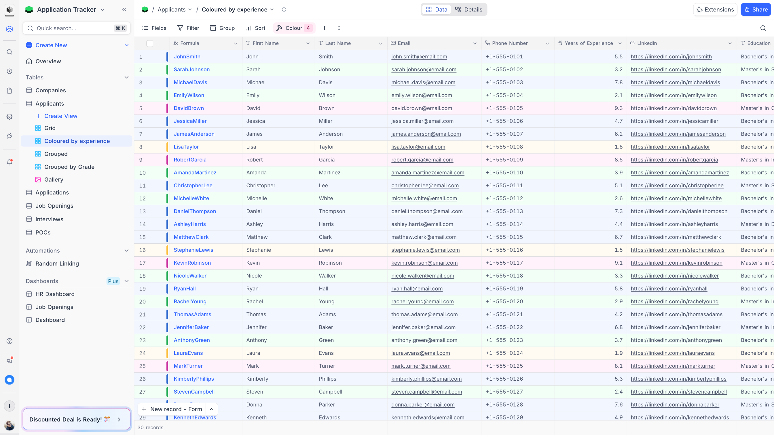
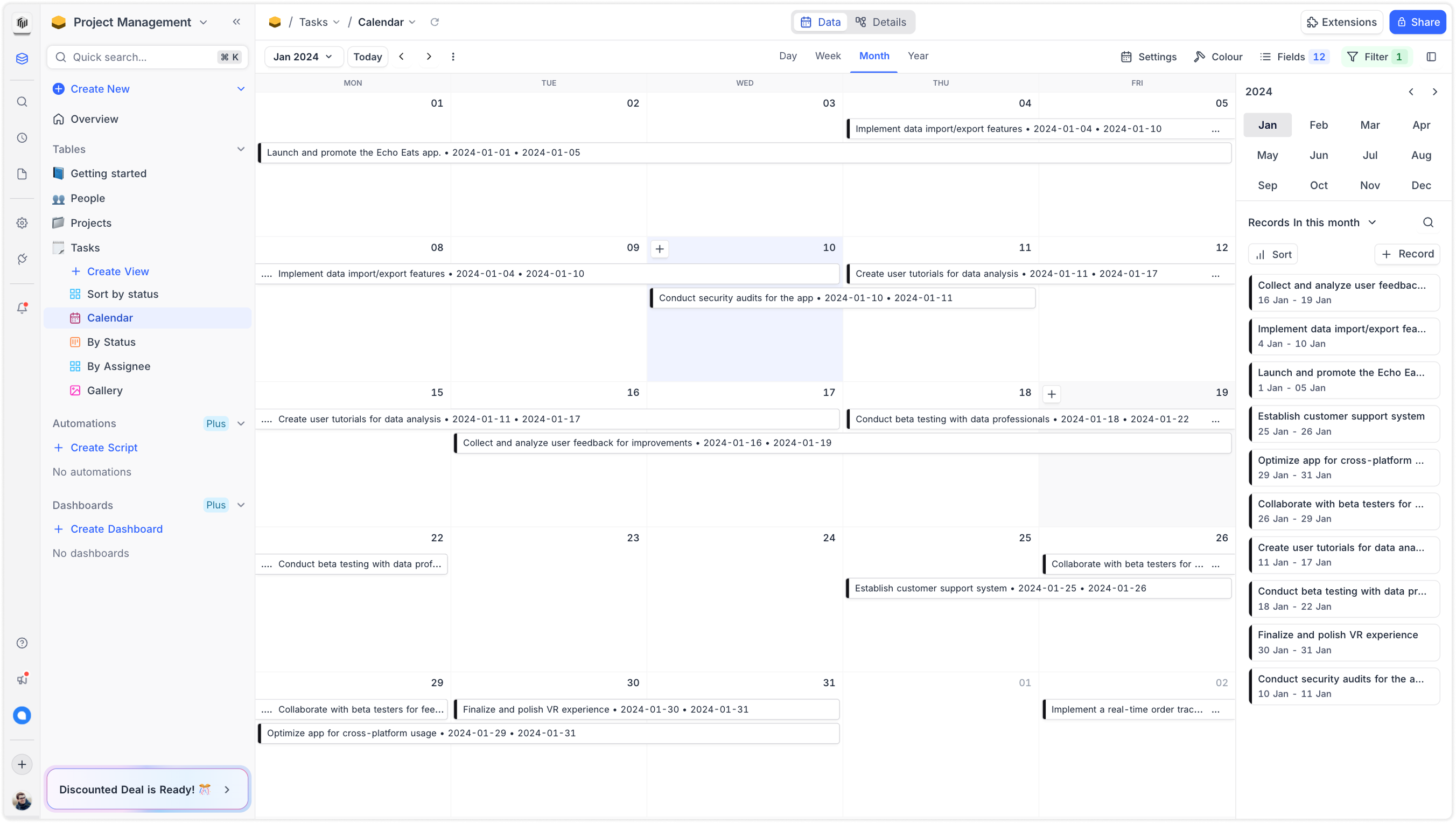
Grid View
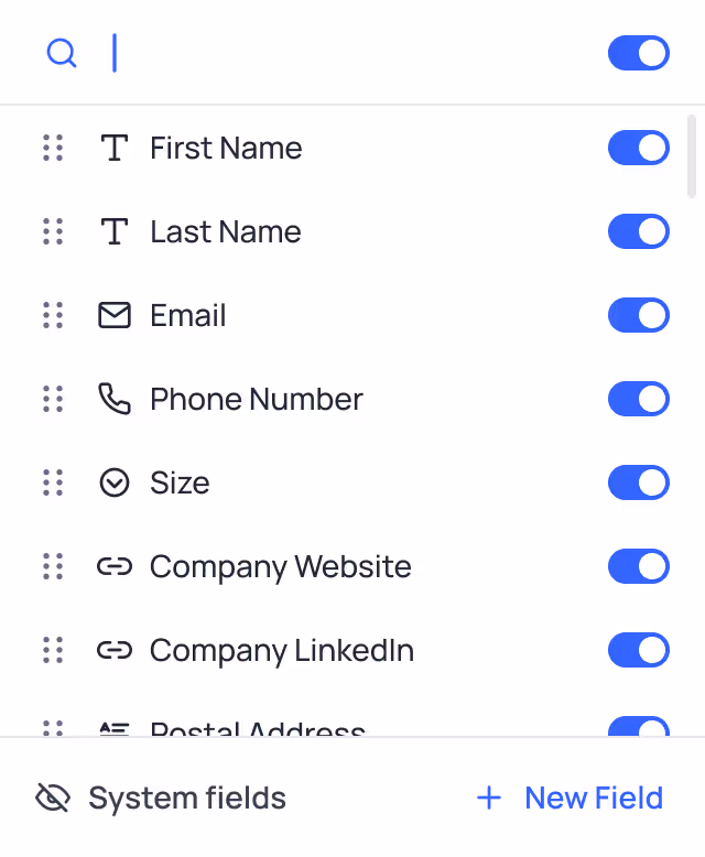
The view was optimised for user productivity, a data rich grid component that prioritises data density, with 25+ data types, we ensured consistent cell behavior across default, hover, selection, and edit states — each with overflow handling — to keep interactions predictable and polished.
Grid
The default type of view, allows users to display their data in a spreadsheet-like interface using rows and columns.
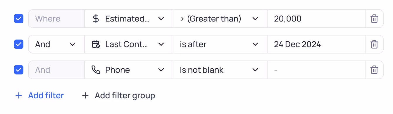
Advanced grid controls
Offering deep control over users data with powerful filters, filter groups, flexible sorting options, field visibility, record grouping and row colouring options.
Cell states
25+ data types defined in 4 states
- default
- hover
- selection
- edit
Along with the corresponding overflow states.
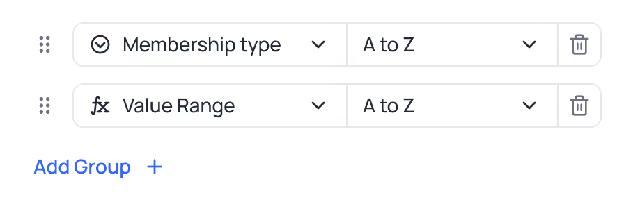
Grouped Grid View
Grouping of records supported accross all filed types, text based, number based, selection based, and more.
Record colouring
Colouring records based on single select option, or based on conditions.
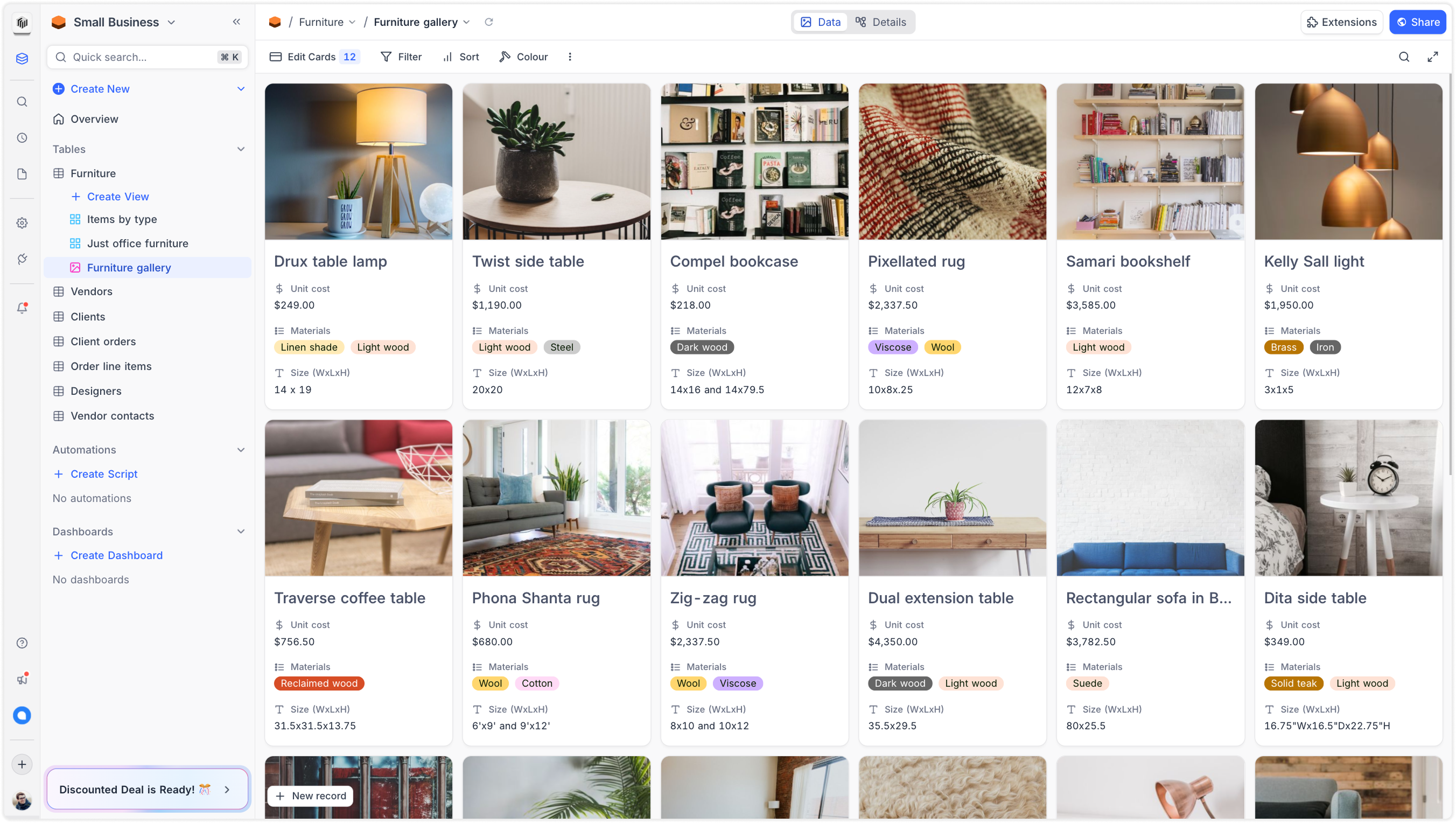
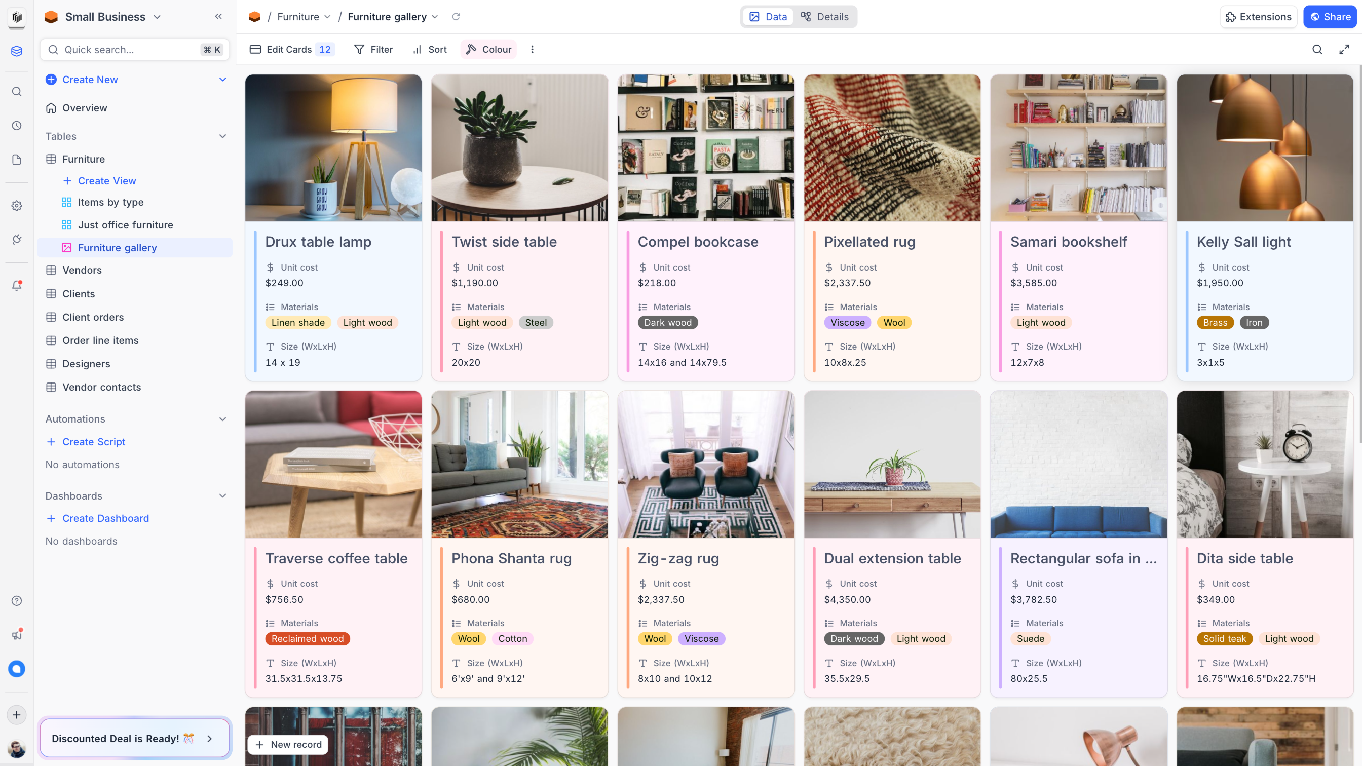
Gallery View
We redesigned the Gallery view to improve visual clarity, optimize card layouts for different field types, and ensure consistency across varying data types.
Gallery
A visual-first layout where an attachment field can be set as the record’s cover image.
Card configuration
From the toolbar’s fields dropdown, users can choose which fields are displayed on the card.
Record colouring
Colouring records based on single select option, or based on conditions.
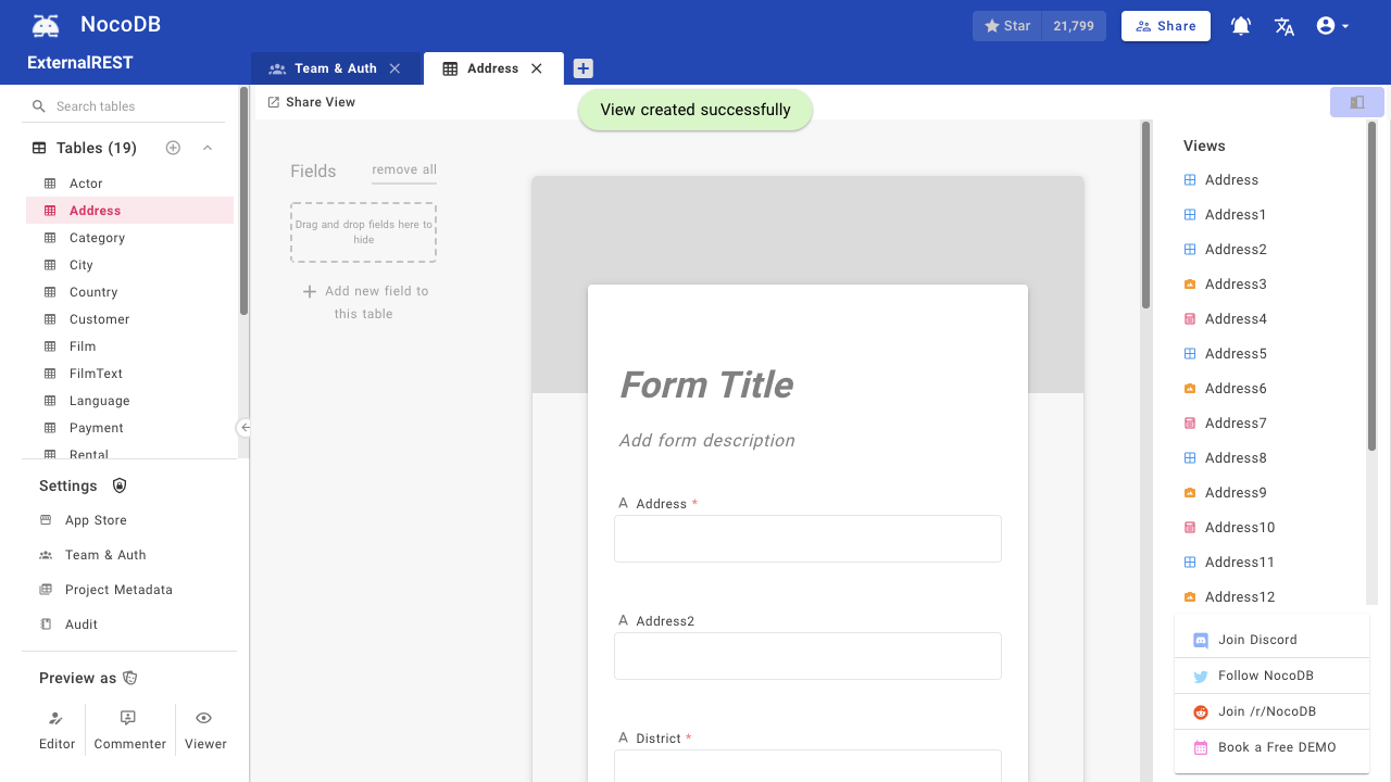
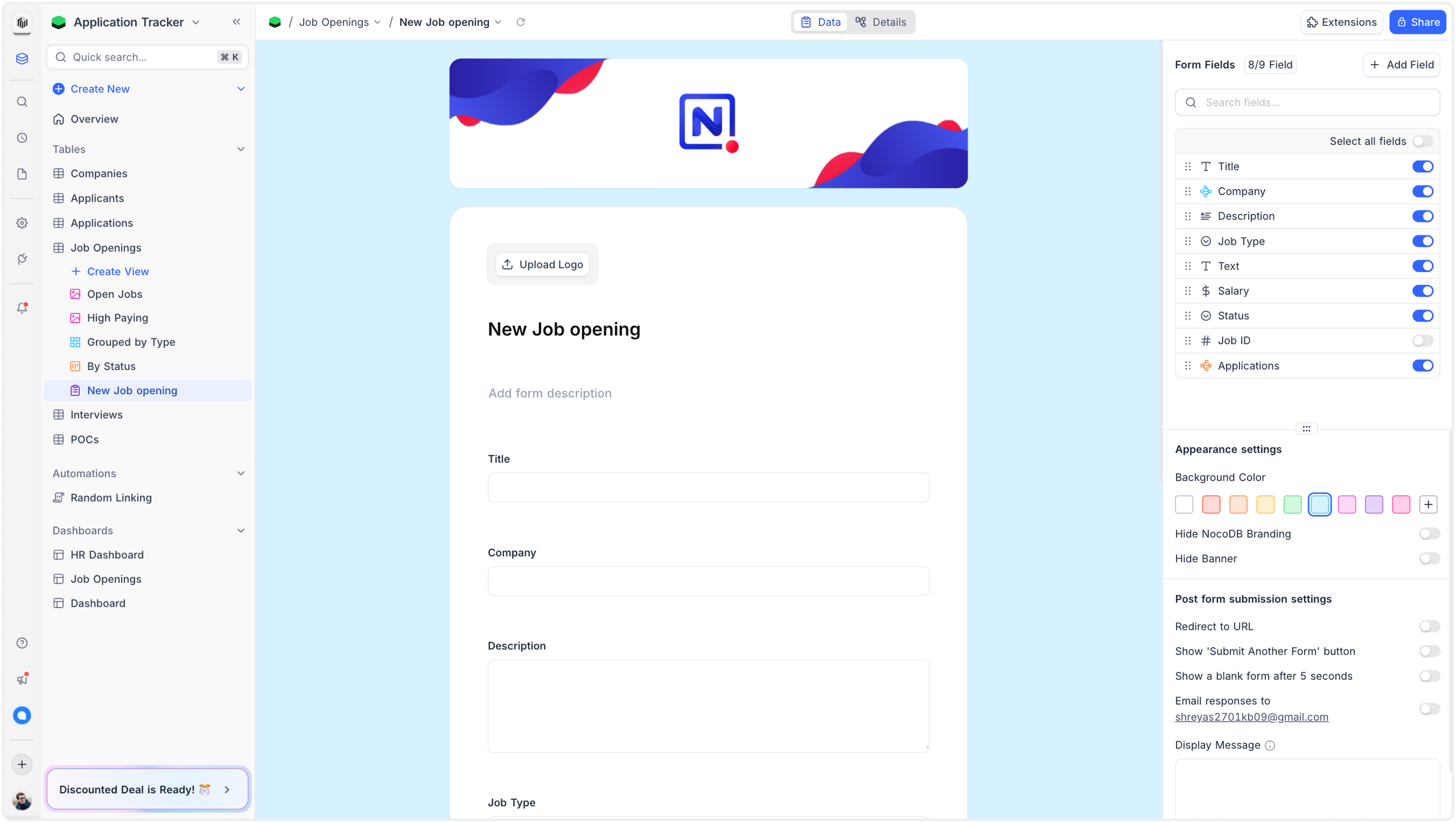
Form View
We completely redesigned the Form view, adding support for conditional field visibility, regex-based input validations, and advanced configurations for all 25+ data types.
Form
A visual-first layout where an attachment field can be set as the record’s cover image.
Advanced configurations
From the toolbar’s fields dropdown, users can choose which fields are displayed on the card.
Kanban View
Designed from the ground up to support large datasets with minimal friction. Prioritized performance, drag-and-drop interactions, and column clarity over traditional project-style boards.
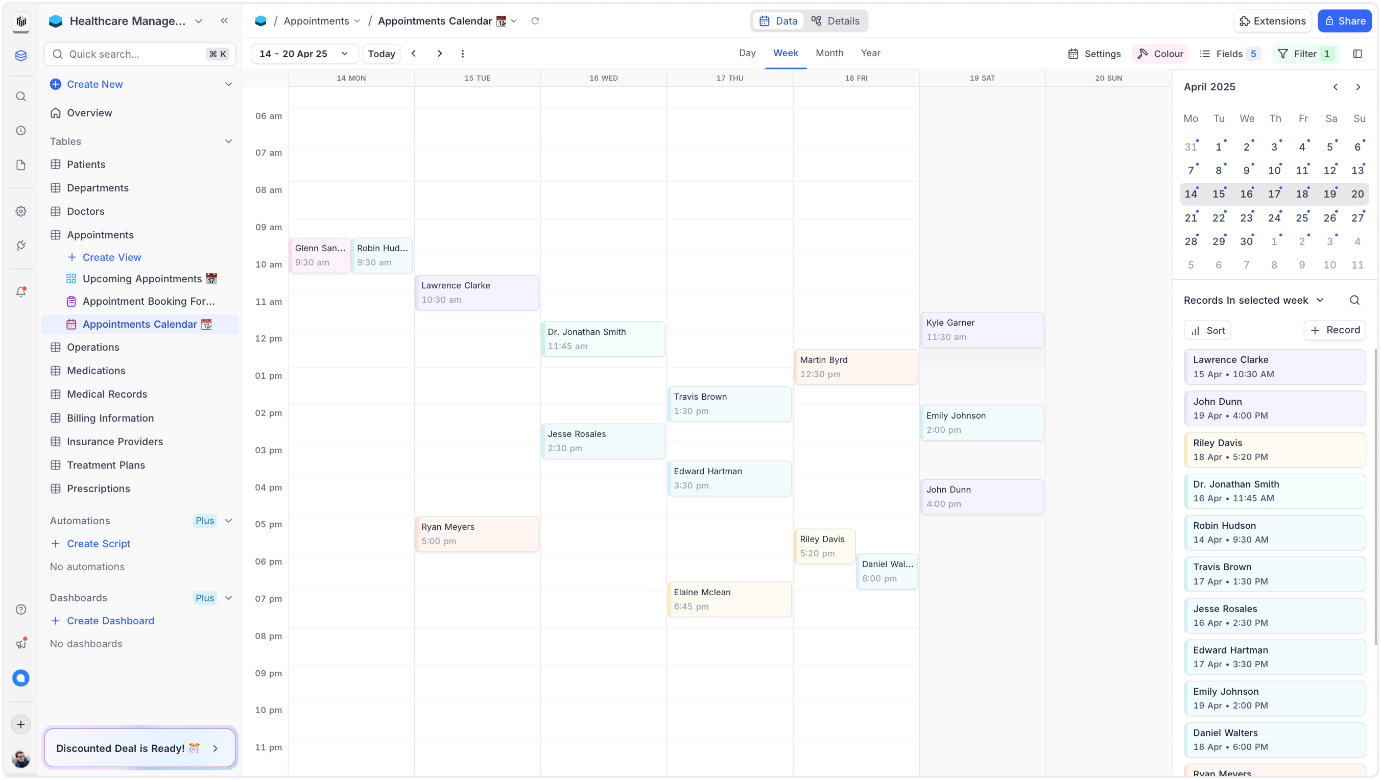
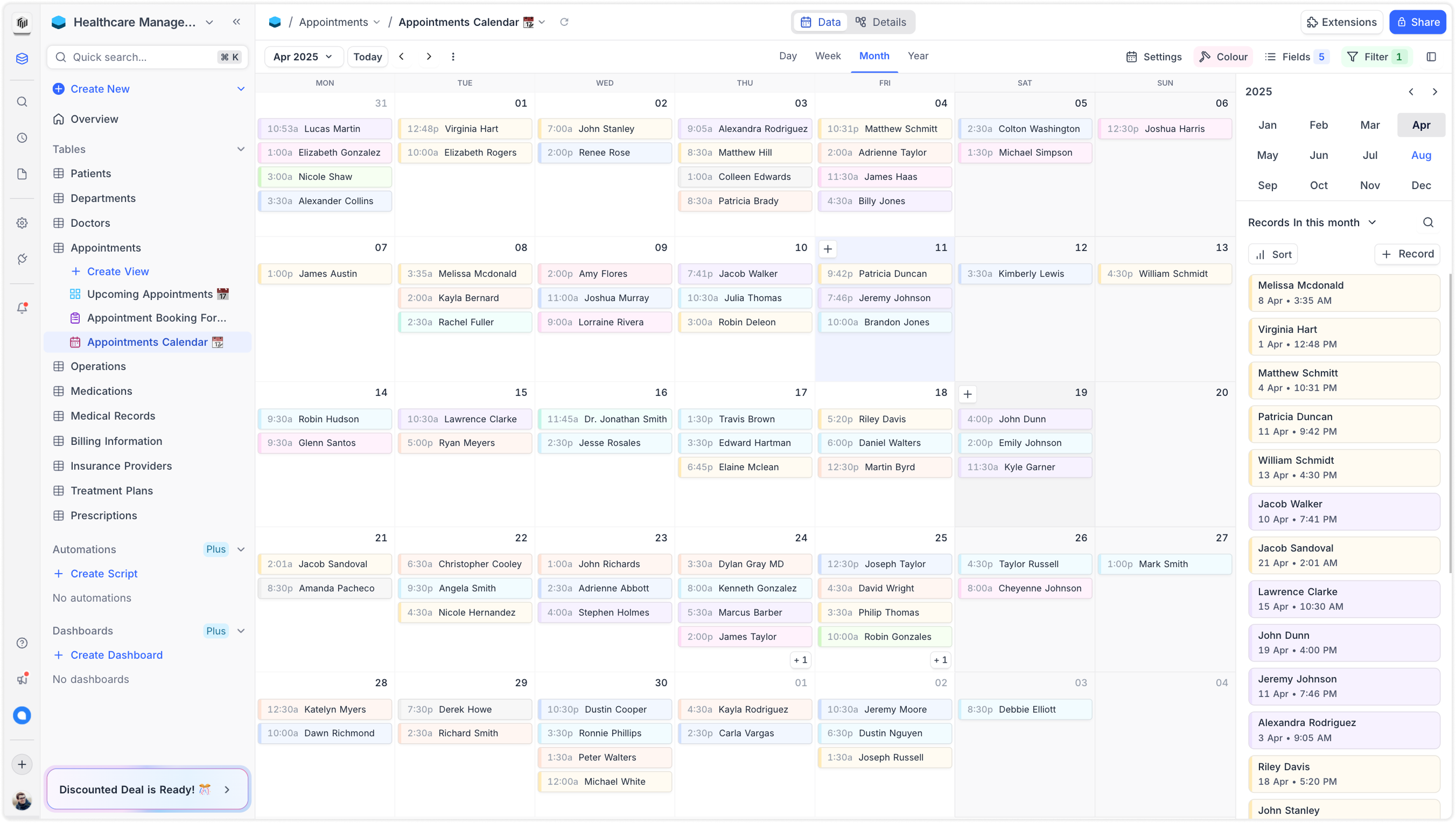
Calendar View
Built specifically for data-heavy use cases—not just event scheduling. Focused on smooth rendering, responsive interactions, and quick field mapping to support high-volume, structured records.
Calendar
A visual-first layout where an attachment field can be set as the record’s cover image.
Timescale view options
From the toolbar’s fields dropdown, users can choose which fields are displayed on the card.
Record colouring
Colouring records based on single select option, or based on conditions.
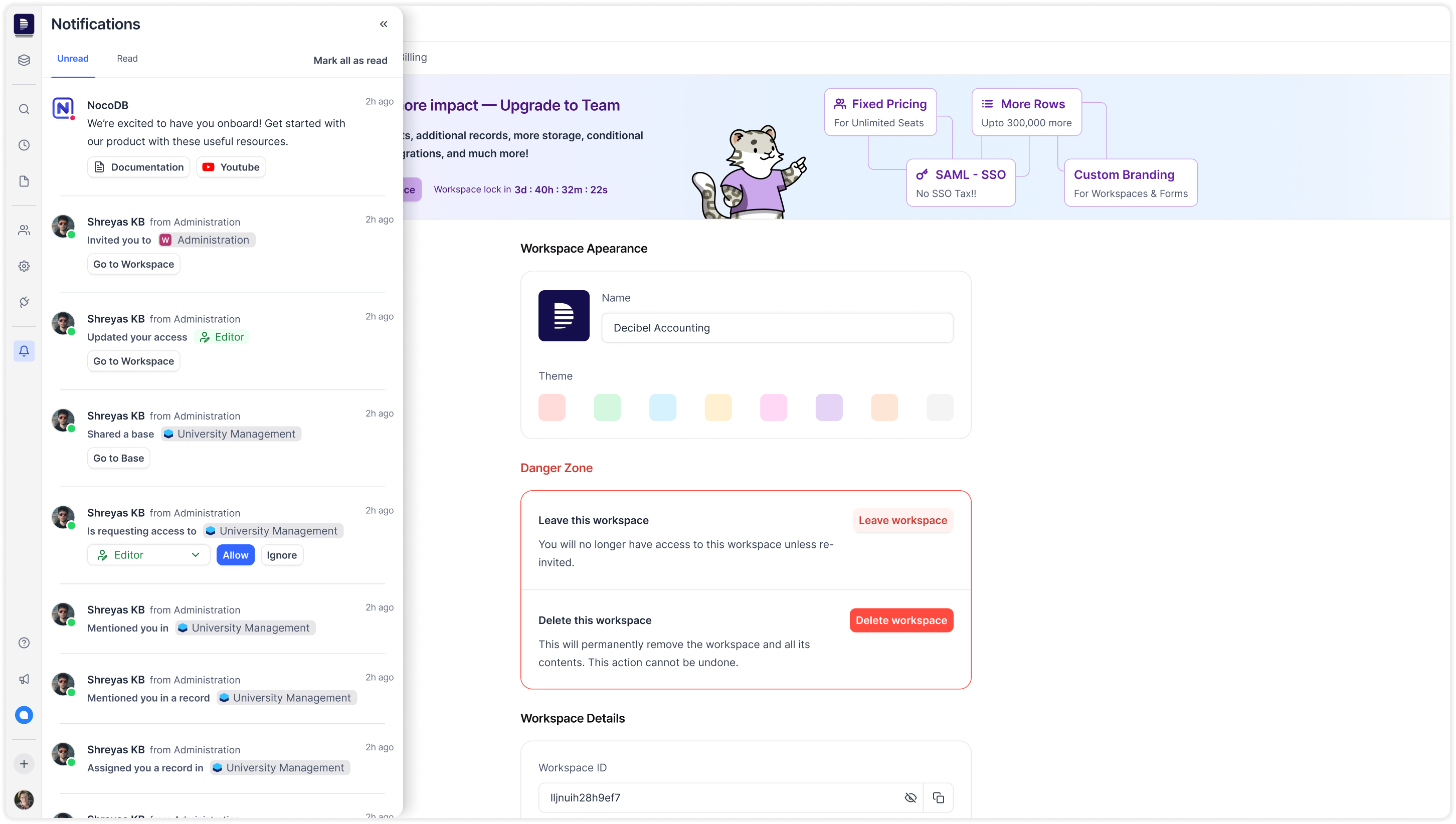
Workspace Management
But the product experience hadn’t kept up. Below are some screenshots of the product before the redesign:
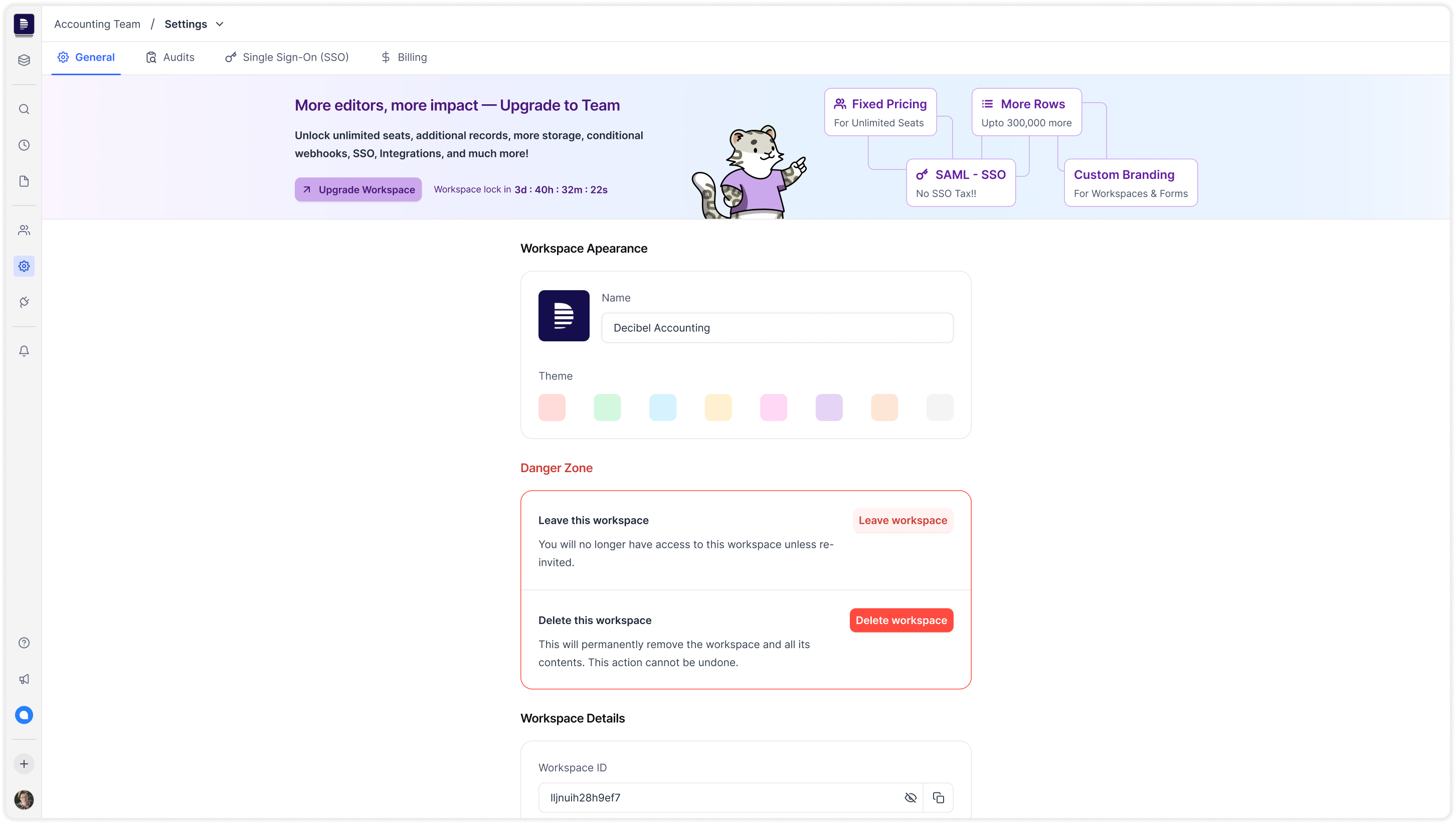
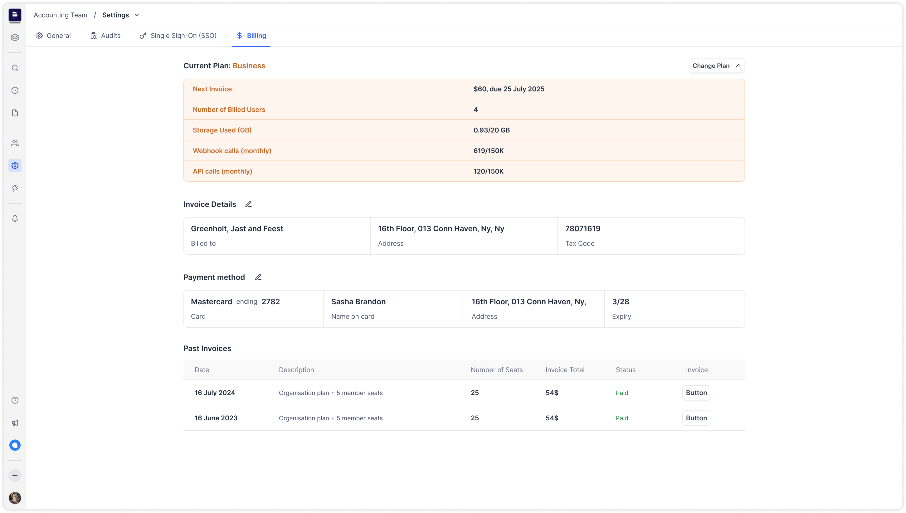
Billing & Settings
But the product experience hadn’t kept up. Below are some screenshots of the product before the redesign:
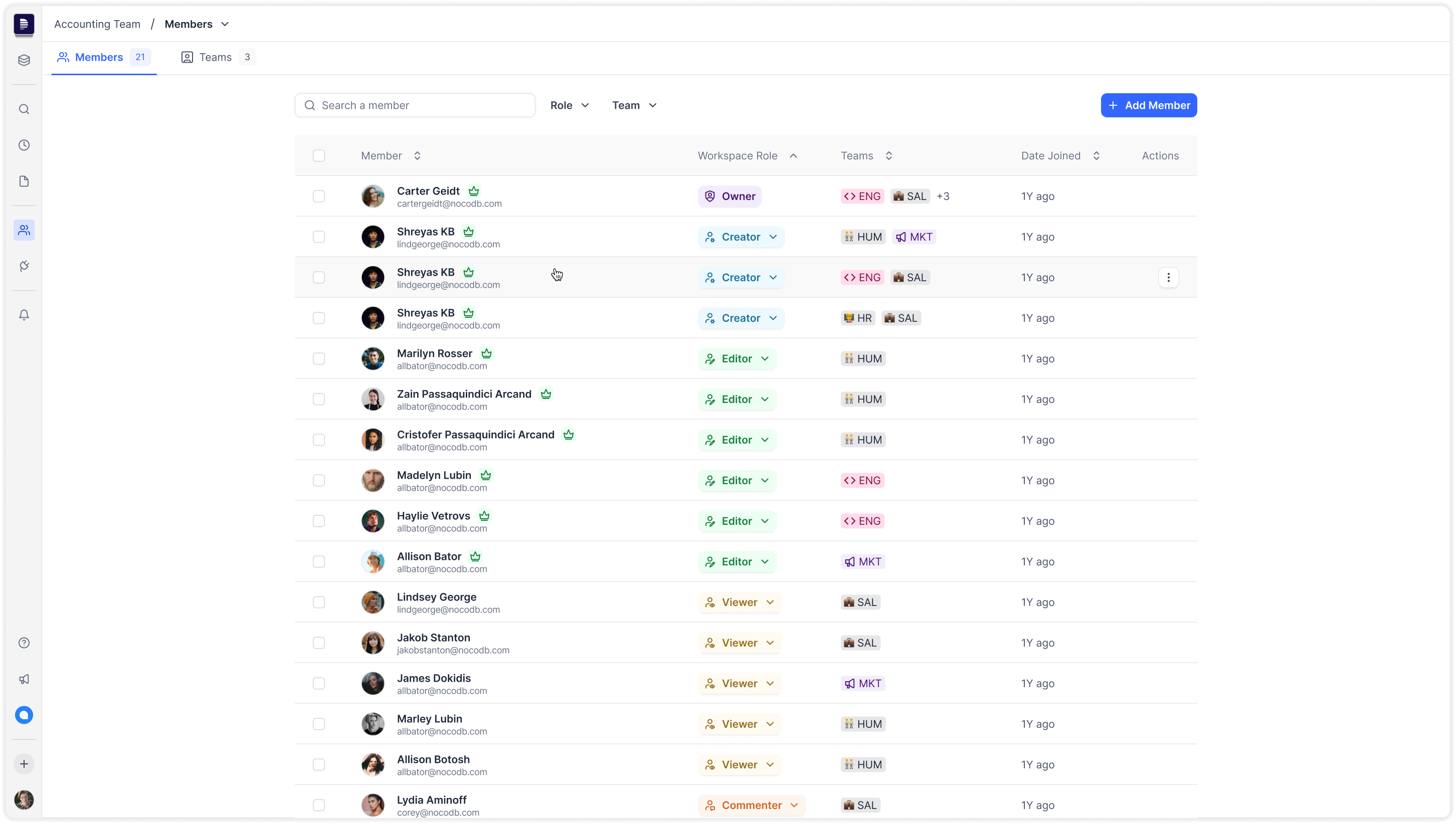
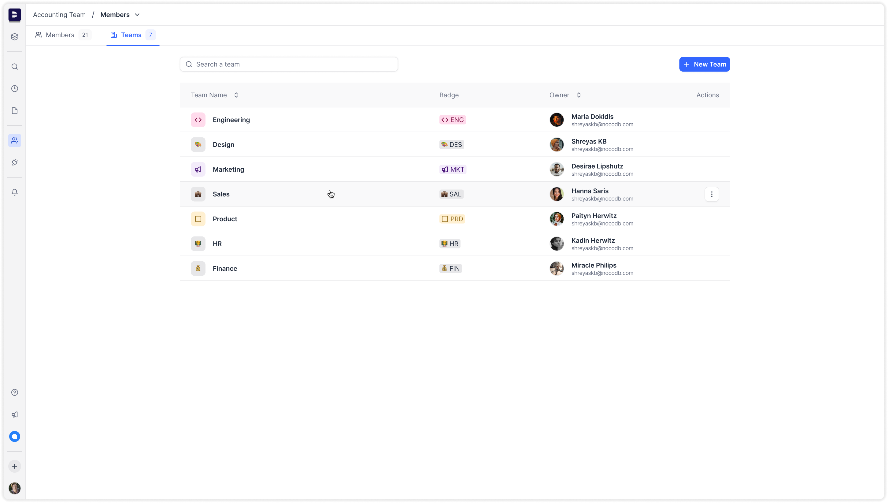
User & Permission Management
But the product experience hadn’t kept up. Below are some screenshots of the product before the redesign:
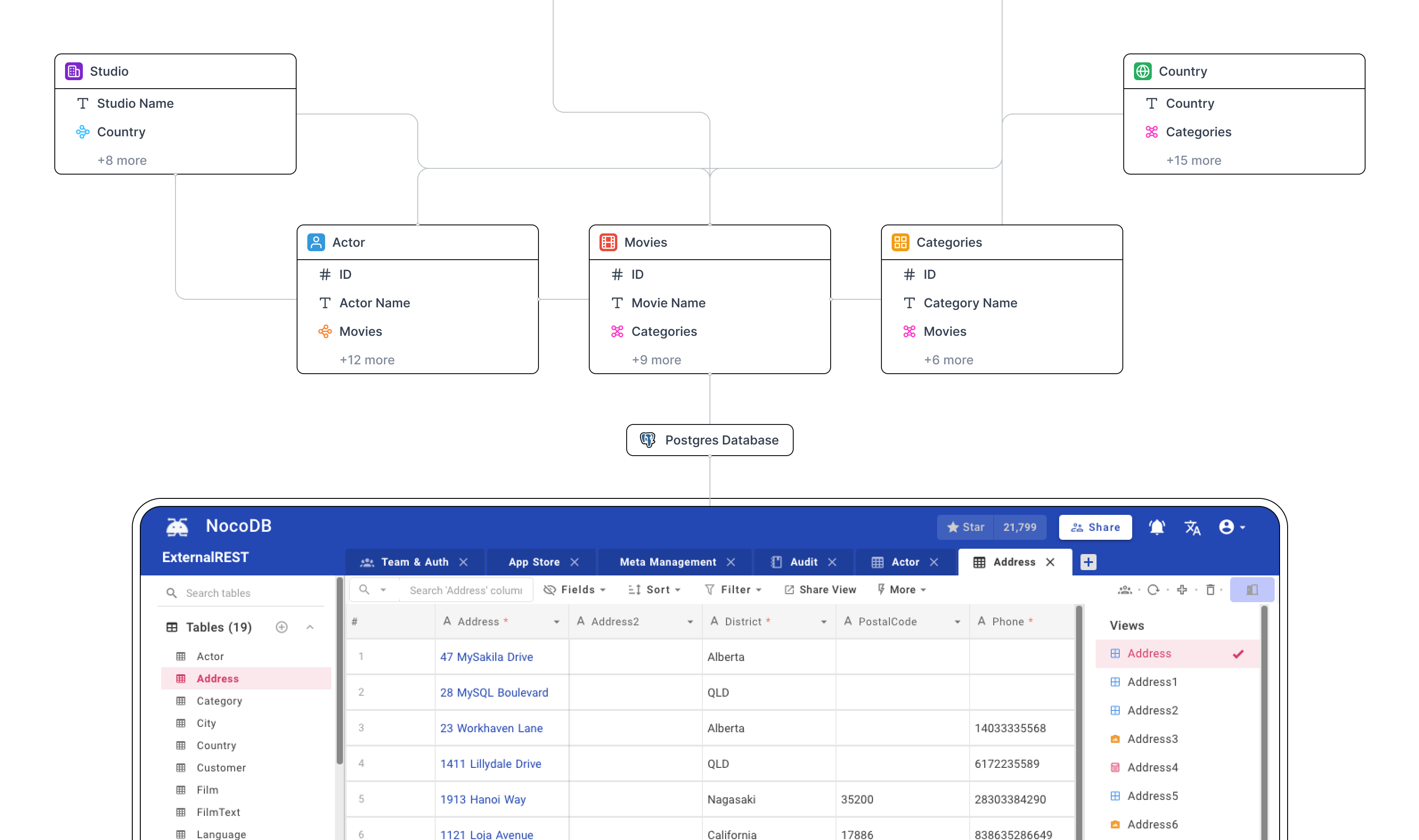
Noco Design System
But the product experience hadn’t kept up. Below are some screenshots of the product before the redesign:
Result
While it was initially designed for developers, we realized that to grow and monetize sustainably, we needed to pivot toward business and enterprise users — users who expect clean interfaces, predictable UX, and little to no onboarding friction.
But the product experience hadn’t kept up. Below are some screenshots of the product before the redesign:
Metrics
While it was initially designed for developers, we realized that to grow and monetize sustainably, we needed to pivot toward business and enterprise users — users who expect clean interfaces, predictable UX, and little to no onboarding friction.
But the product experience hadn’t kept up. Below are some screenshots of the product before the redesign: